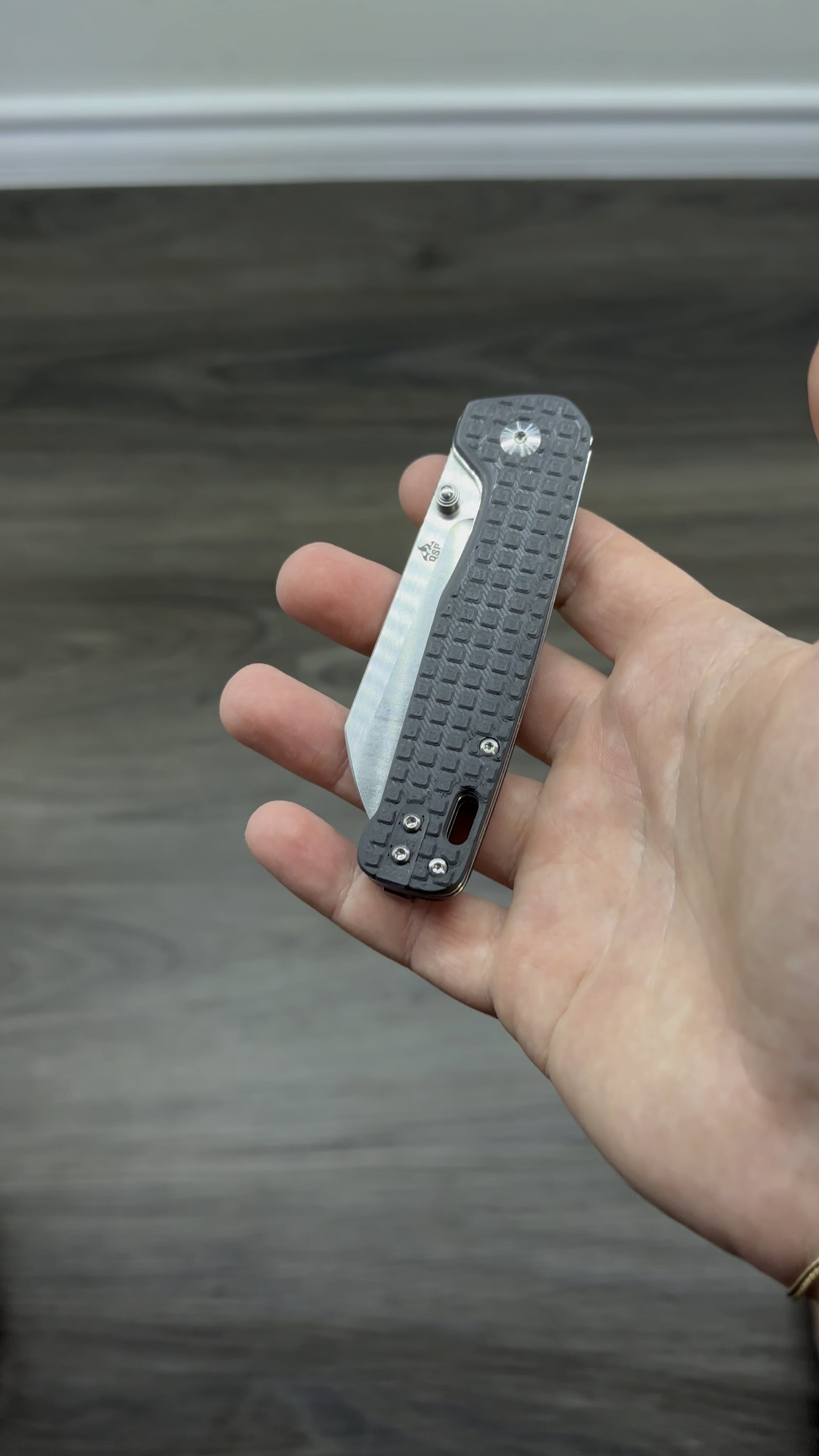
Should I tighten the pattern spacing up or leave it as is?
Not sure how much I like this design in black. I think ruby red or lapis lazuli blue is a better move.
I am also trying to design a different pattern design as I want to do something other than what’s already available, but this was just a proof of concept for me in terms of learning Fusion 360.
I think a pattern design similar to goyard would be sick.
by therealisticjoe


